


QR Pay by DiveHQ
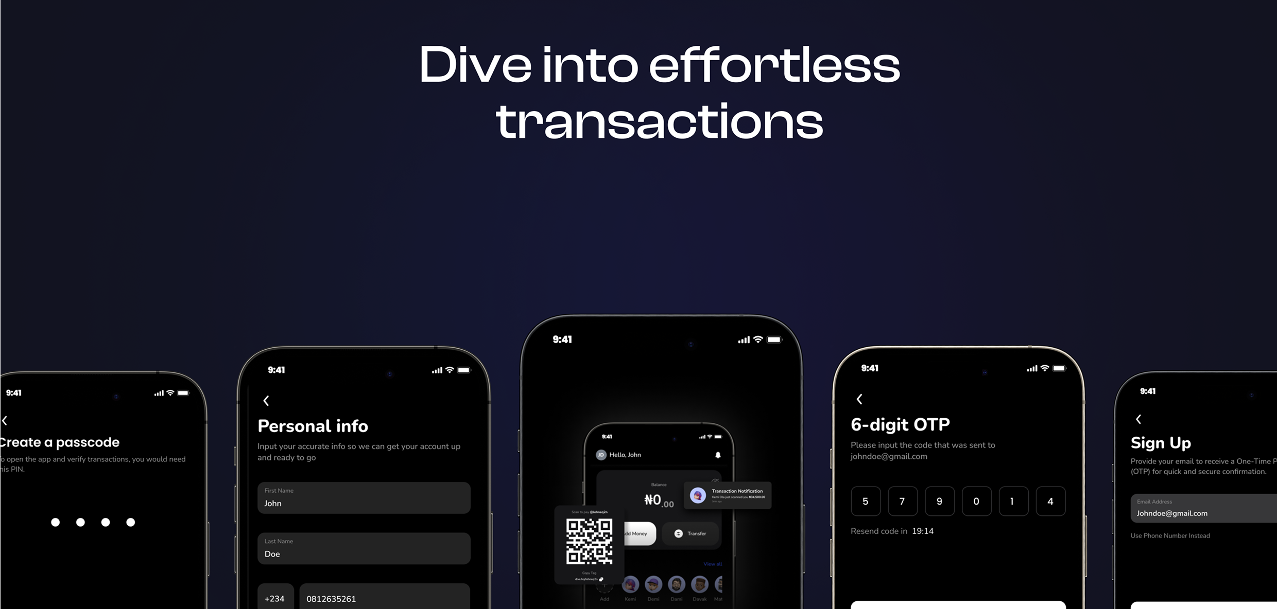
Dive into effortless transactions.
Traditional payment methods often involve unnecessary steps and friction, creating barriers to fast, secure transactions. DiveHQ identified this gap and set out to address it through a comprehensive mobile payment application.
THE SOLUTION
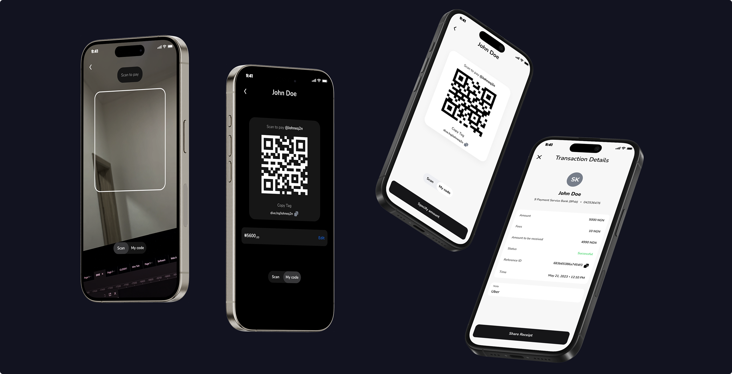
QR Pay addresses these challenges through a streamlined mobile payment experience centered on Scan to Pay functionality, enabling near-instant transactions. The app extends beyond scanning to include direct bank transfers, customizable Dive Tags for simplified payments, and effortless bill-splitting, consolidating essential payment functions into a single, cohesive platform.
ROLE
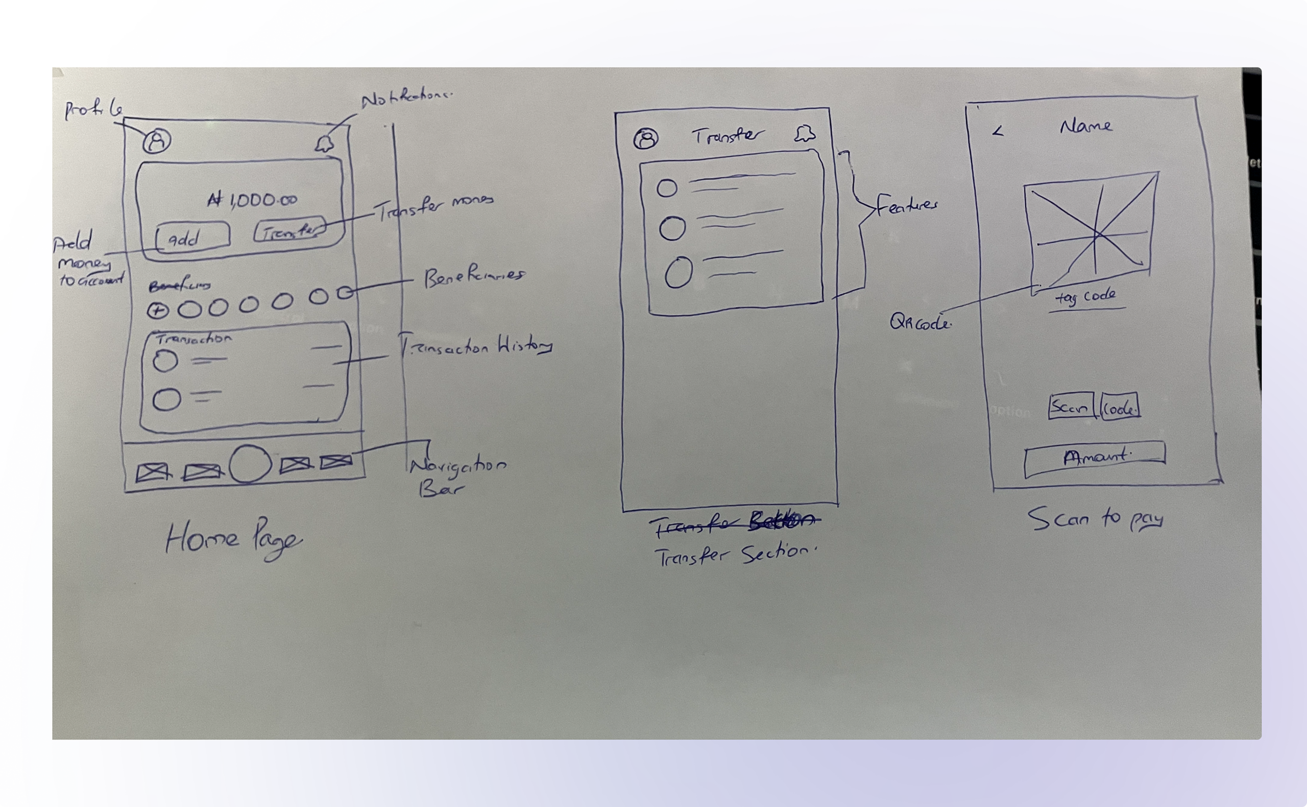
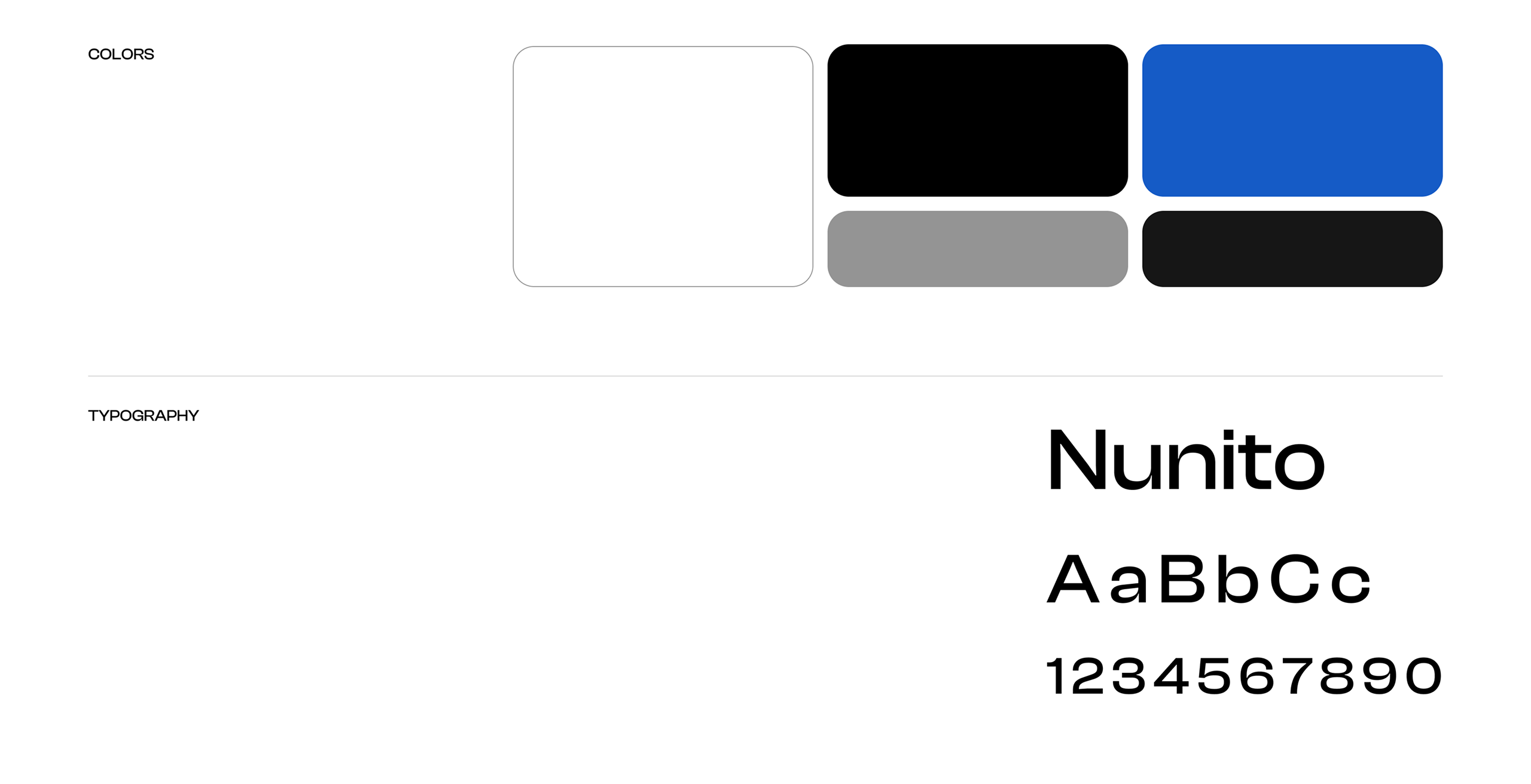
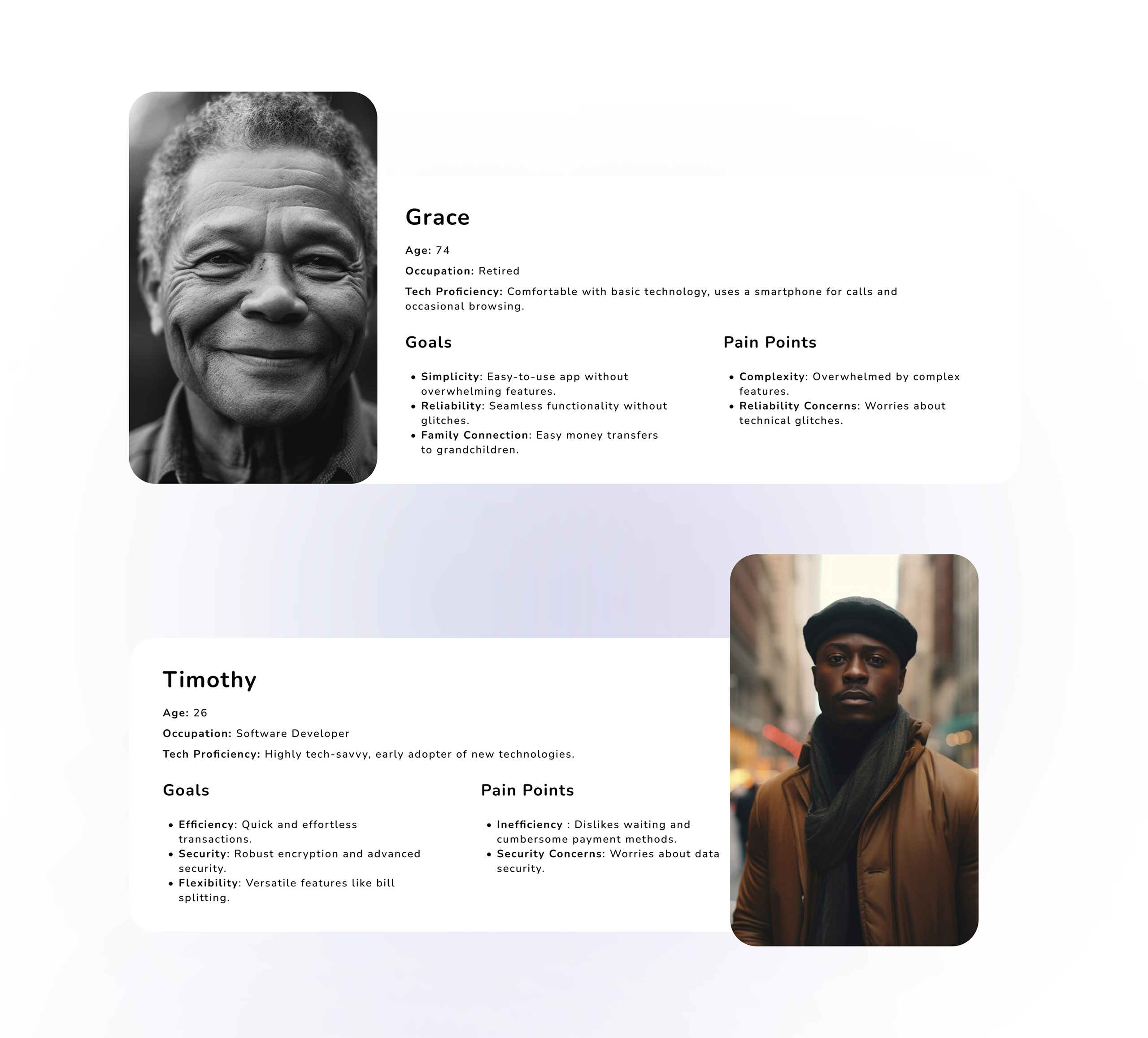
As the lead designer and researcher on QR Pay, I owned the entire user experience end to end. From conducting the user research, developing personas spanning DiveHQ's full audience, and translated those insights into the product's direction. From there, I defined the user flows, created the wireframes, and built out the visual identity and full interface across both light and dark modes keeping the experience simple, consistent, and user-centered throughout.

WRAPPING UP
At its core, QR Pay reflects the principles of simplicity and adaptability. This project reinforced a central lesson: in fintech, user-centric design is not a finishing touch but the foundation of a successful product. By staying responsive to real user needs, validating decisions through personas and flows, and consistently prioritizing simplicity over complexity; delivering an experience that feels effortless and trustworthy is easy.