
Nuton
Learn it once. Actually remember.
Since launching Nuton has helped over 150000 students create 3000000+ structured learning plans.
Nuton (Newton) is an AI powered learning tool that turns any source material into a structured course with an adaptive tutor. A learner drops in a PDF, slide deck, video, YouTube link, audio file, article, or block of text and Nuton generates organized lessons, flashcards, quizzes, a podcast version, and lets you make notes around it.
THE PROBLEM
Learners today are not short on material. They have lecture recordings, hundred-page readings, slide decks and endless articles. What they lack is a way to move through it. Sitting through a two-hour lecture hands you everything at once and a path through none of it, so learners resort to skimming through unfinished reading and miss more than they take in. Existing tools widen the gap instead of closing it: note-taking and flashcard apps each tackle one piece of the puzzle and the learner still has to assemble them. They are left to structure the material themselves, and most do not. The path through the content becomes a job of its own, a job that gets in the way of actually learning.
ROLE
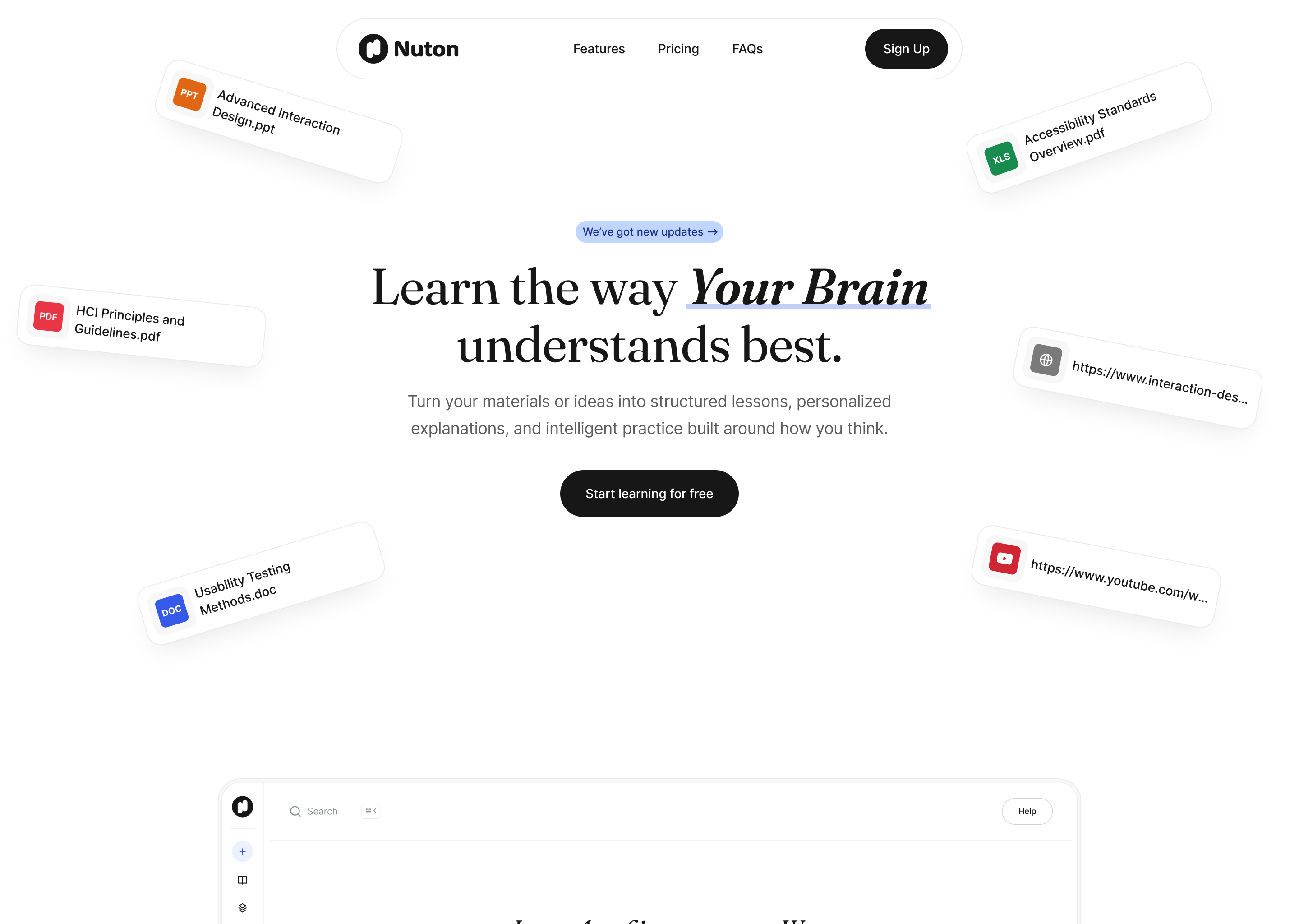
My role had two distinct parts. On Nuton's website I led the redesign, taking an existing site and reworking it end to end into something that better communicated the product's value and positioning. On the app side, I took the design from zero for both mobile and web experiences to something shippable. Drawing from the research direction I knew the design needed to achieve the following:
- Make the input step feel effortless for any source type: PDF, video, link, audio, or plain text.
- Make the generated plan feel trustworthy and worth starting.
- Keep the learning tools (lessons, tutor, flashcards, podcast, notes, quizzes) unified under one visual language.
- Keep the time to first value short enough that the product felt like a tool, not a course.
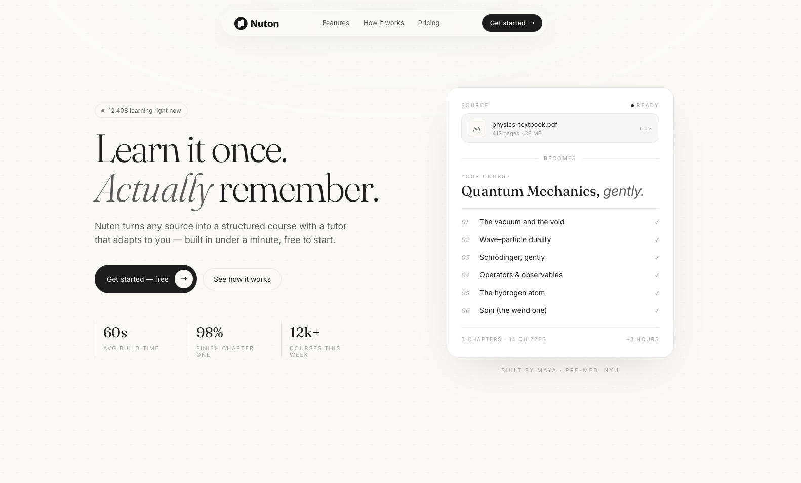
The old website landing page vs the redesigned version
TRANSLATING RESEARCH INTO A VISUAL DIRECTION
The research gave me a clear spine to design around: a learner drops in a source, waits briefly and gets back a structured course. My task was to give that spine a face that could carry the product across very different moments, from a blank upload screen to a finished six-chapter course. I started by pulling references from outside the ed-tech category, leaning toward editorial layouts and reading-focused apps that handle density gracefully rather than similar products that tend to lean playful or gamified.
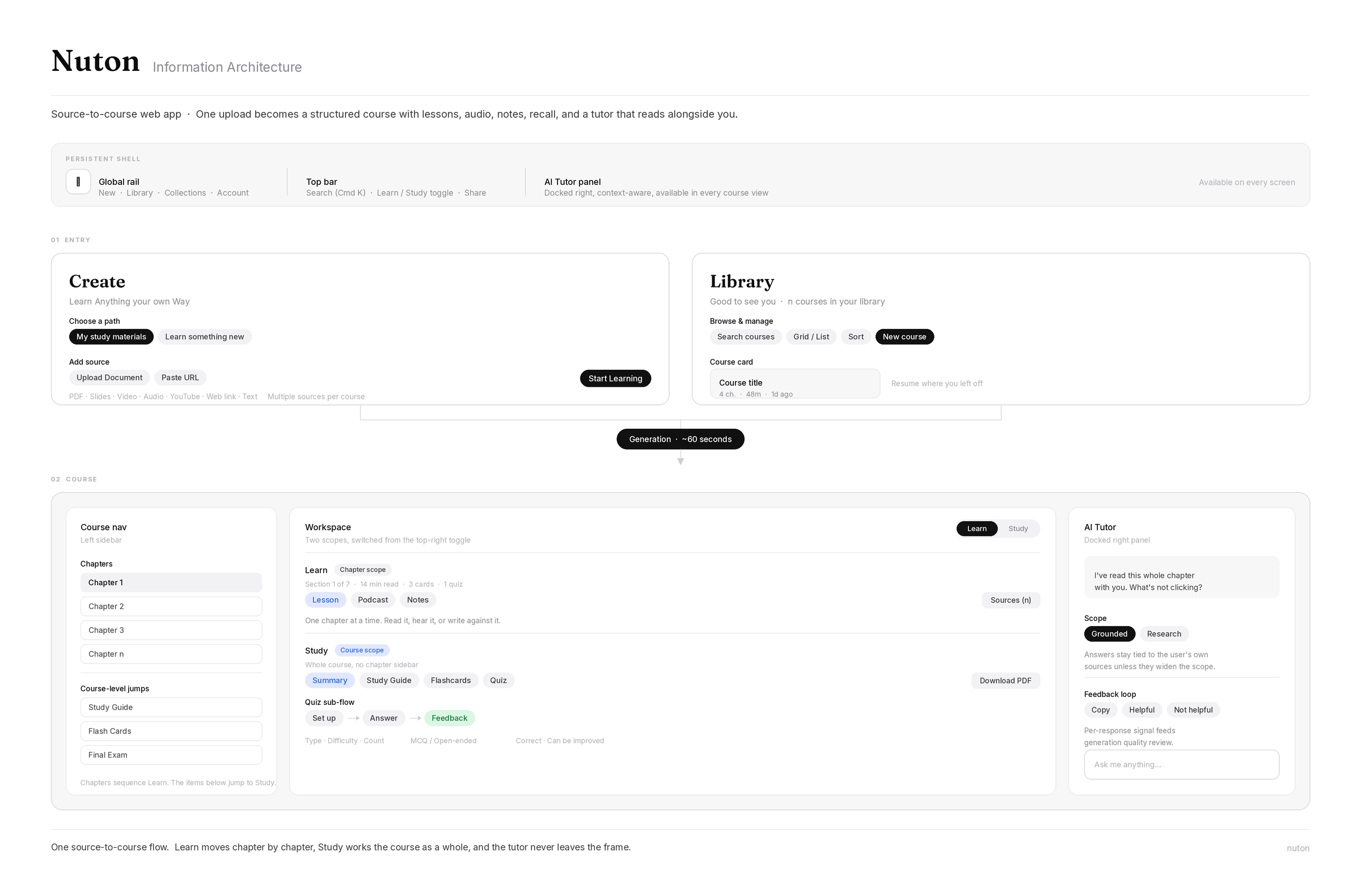
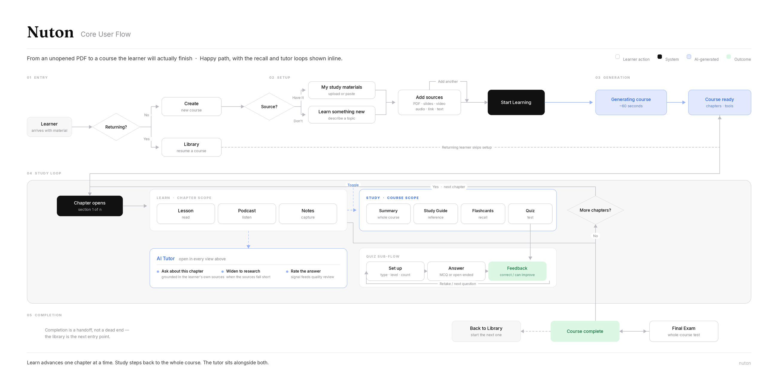
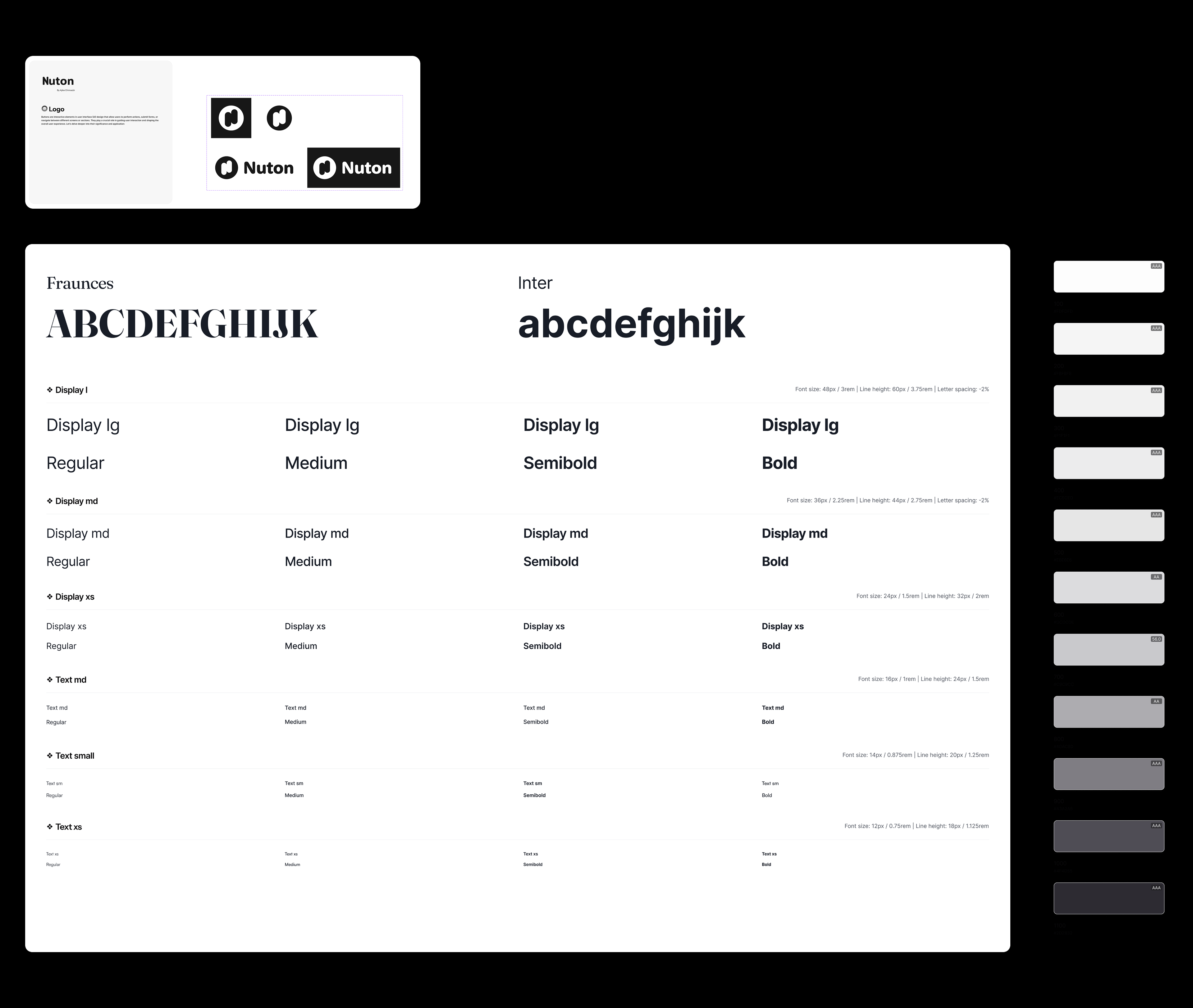
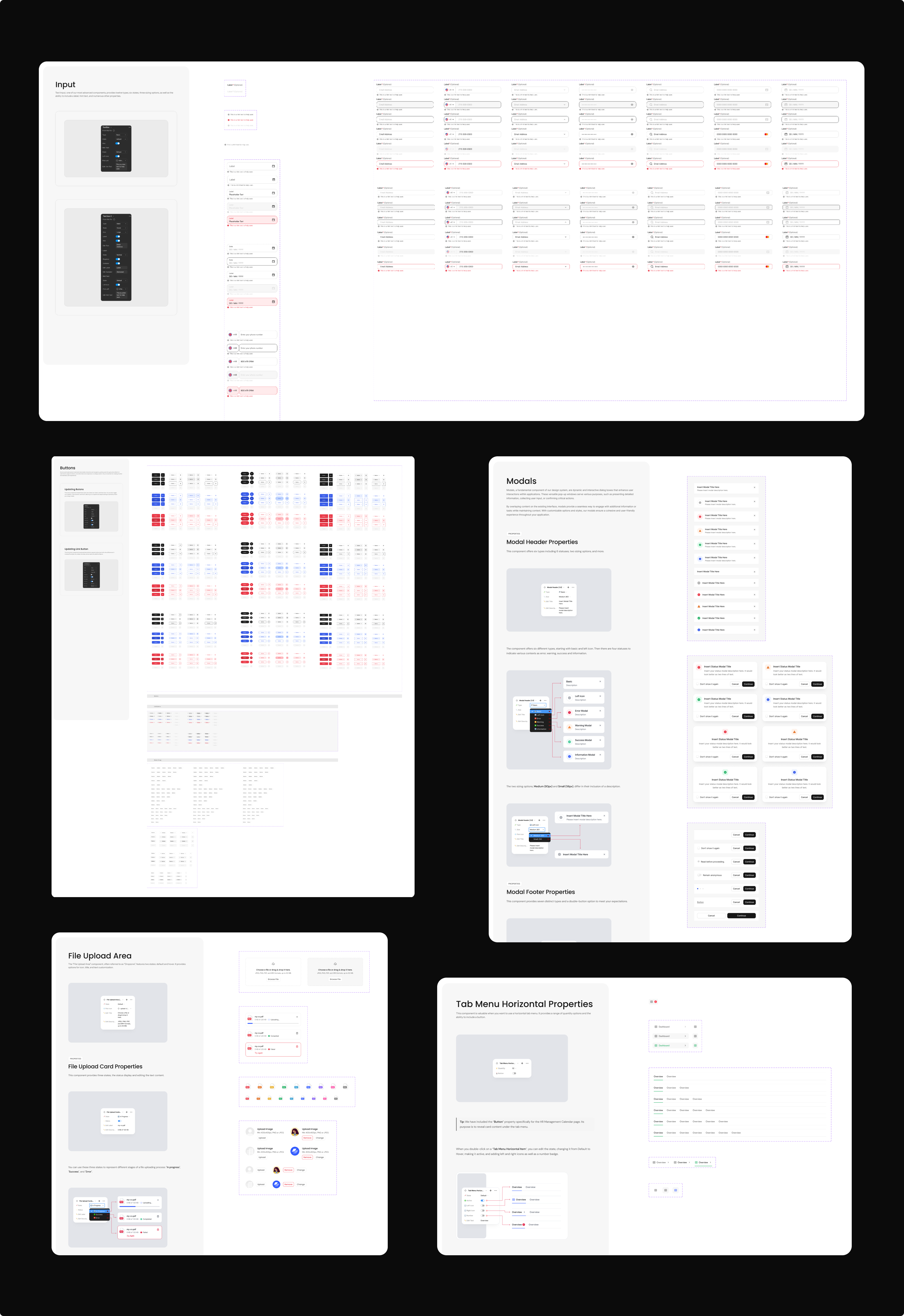
The direction I landed on was shaped by one central tension: the product makes a bold promise, turning something as dense as a four-hundred-page textbook into a usable course in about a minute and a visual language that felt too decorated would undercut that promise before a learner even saw the result. To start I drafted a baseline Information architecture in order to give the platform structure because six tools is a lot of surface for one product. Mapping the architecture was how I checked whether it held together or just accumulated. For the user flow there are two ways in, one loop once you are there. New learners come with material and need a course built from it. Returning learners want to land back where they stopped. Everything after that is the same cycle of reading a chapter, testing recall, asking the tutor when something does not land and advancing. For the design system, I defined the tokens and variables, pulled the common components from an existing UI kit and designed the product-specific ones myself. Generous whitespace, a quiet color palette, a small documented component set and typography doing the expressive work, so the interface read as considered and capable rather than novel.
DESIGNING THE INPUT EXPERIENCE
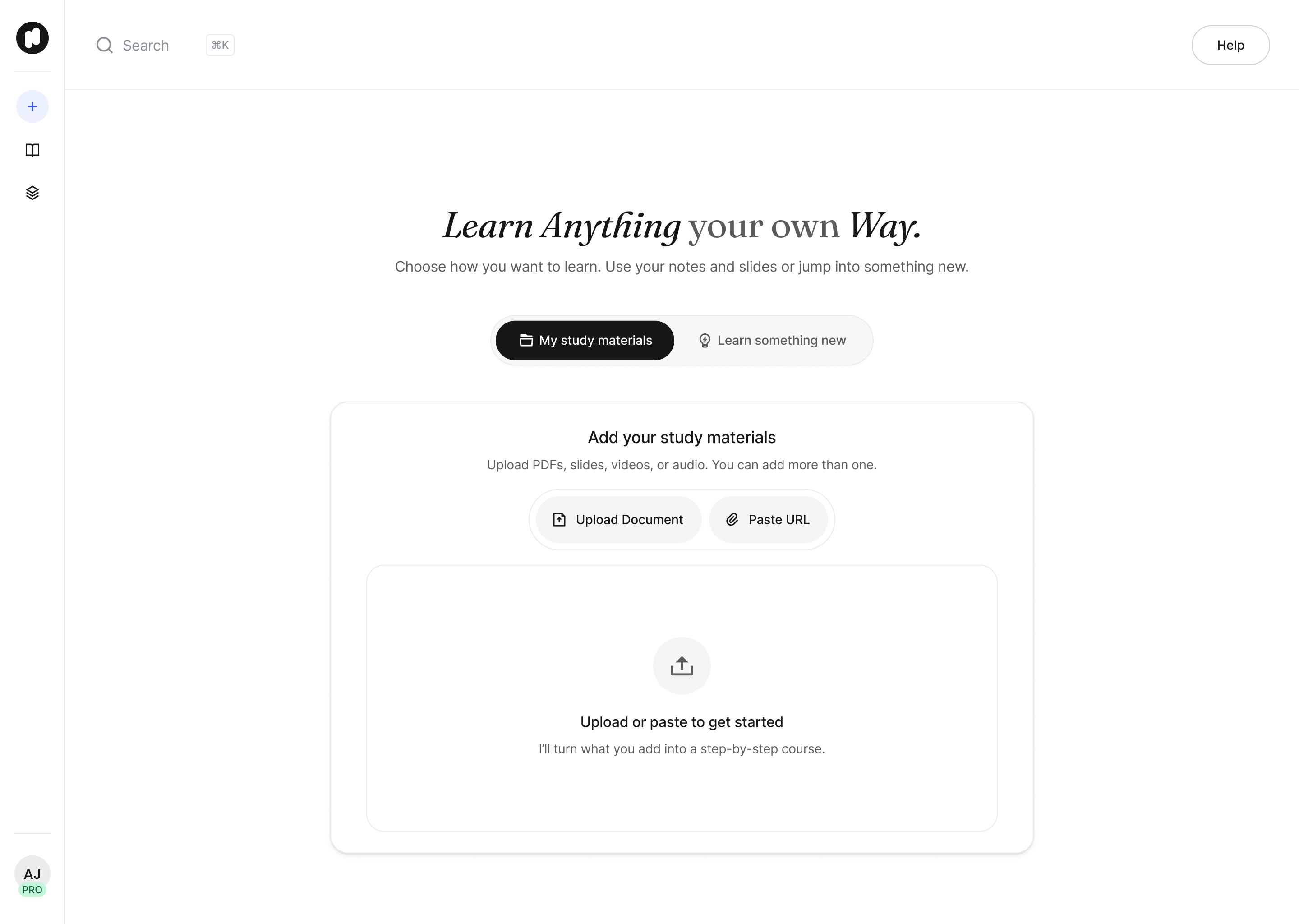
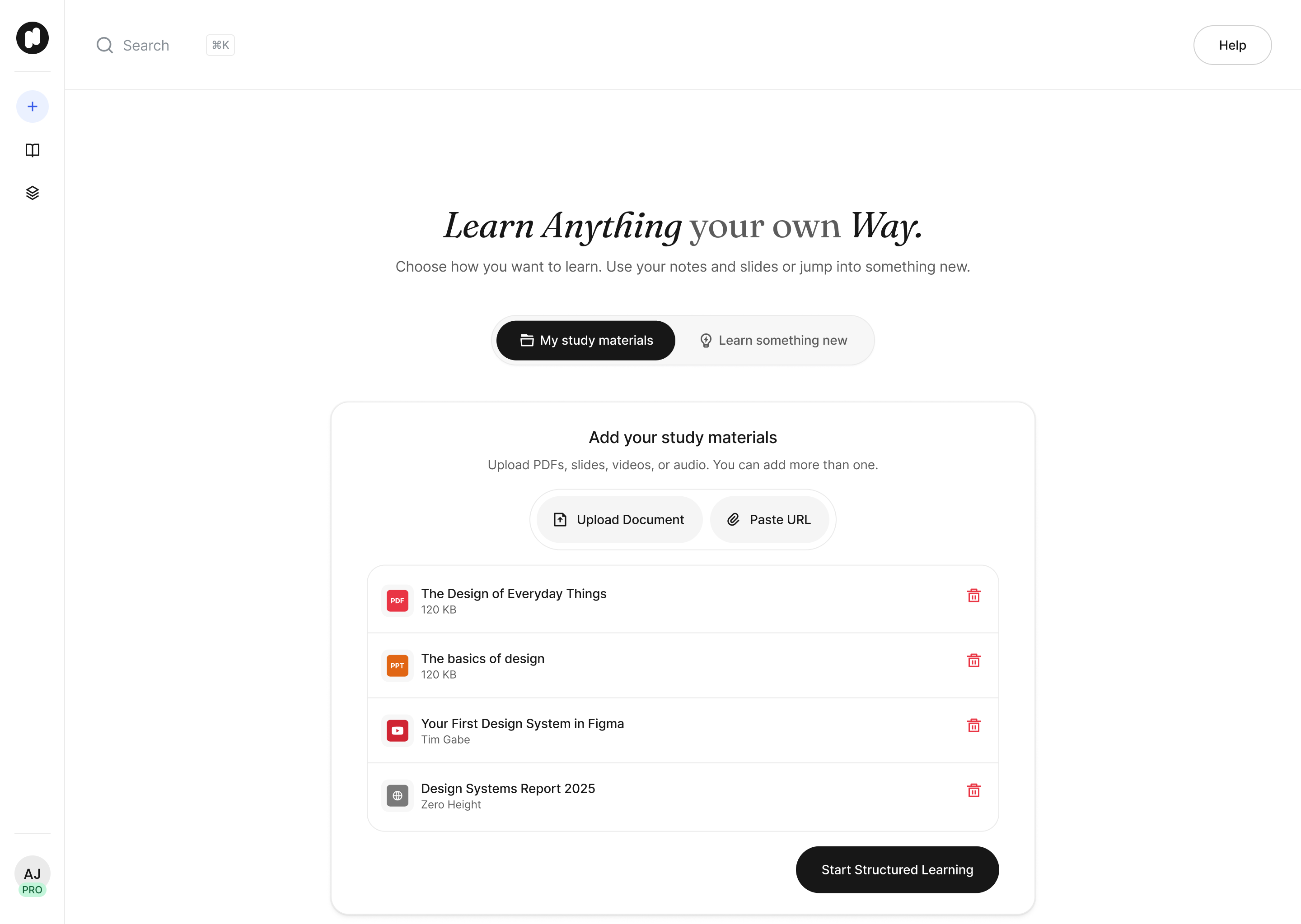
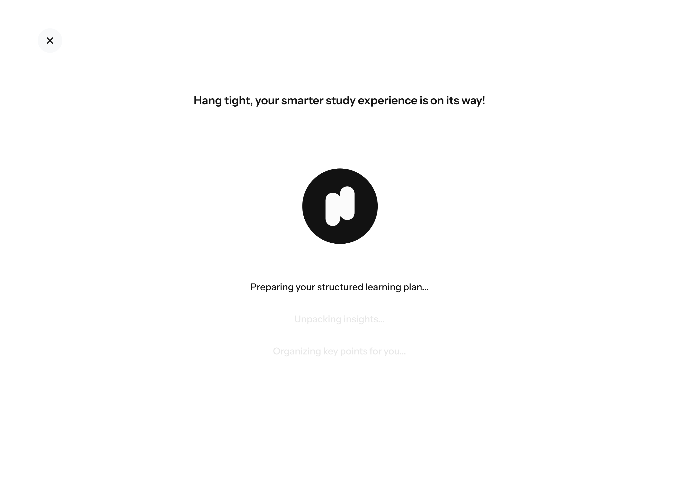
The input screen had to absorb real variety. PDFs, slide decks, video, YouTube links, audio, articles and plain text, without ever feeling like a settings panel a learner had to study before getting started. I treated the empty state as the real first impression of the product, since it is the first thing anyone sees before the magic happens while designing around a single, generous drop target as the visual anchor. The intent was for the screen to say bring me anything, not ask the learner to choose carefully. The loading and generating states needed more attention than usual because of the wait built into the product. Rather than a generic spinner, I wanted that time to feel like visible progress, a sense that the source was actively being read and organized.
DESIGNING THE GENERATED PLAN
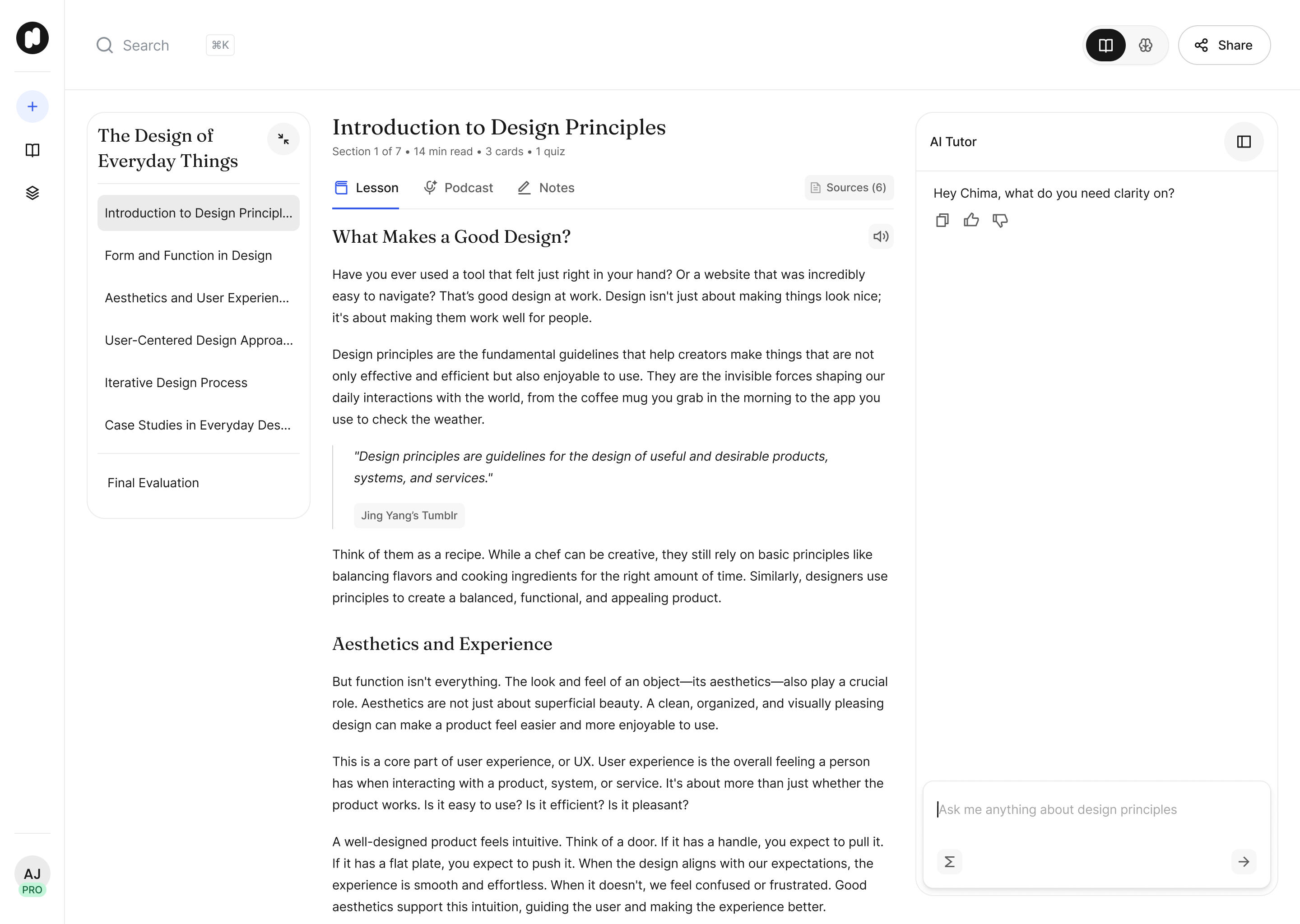
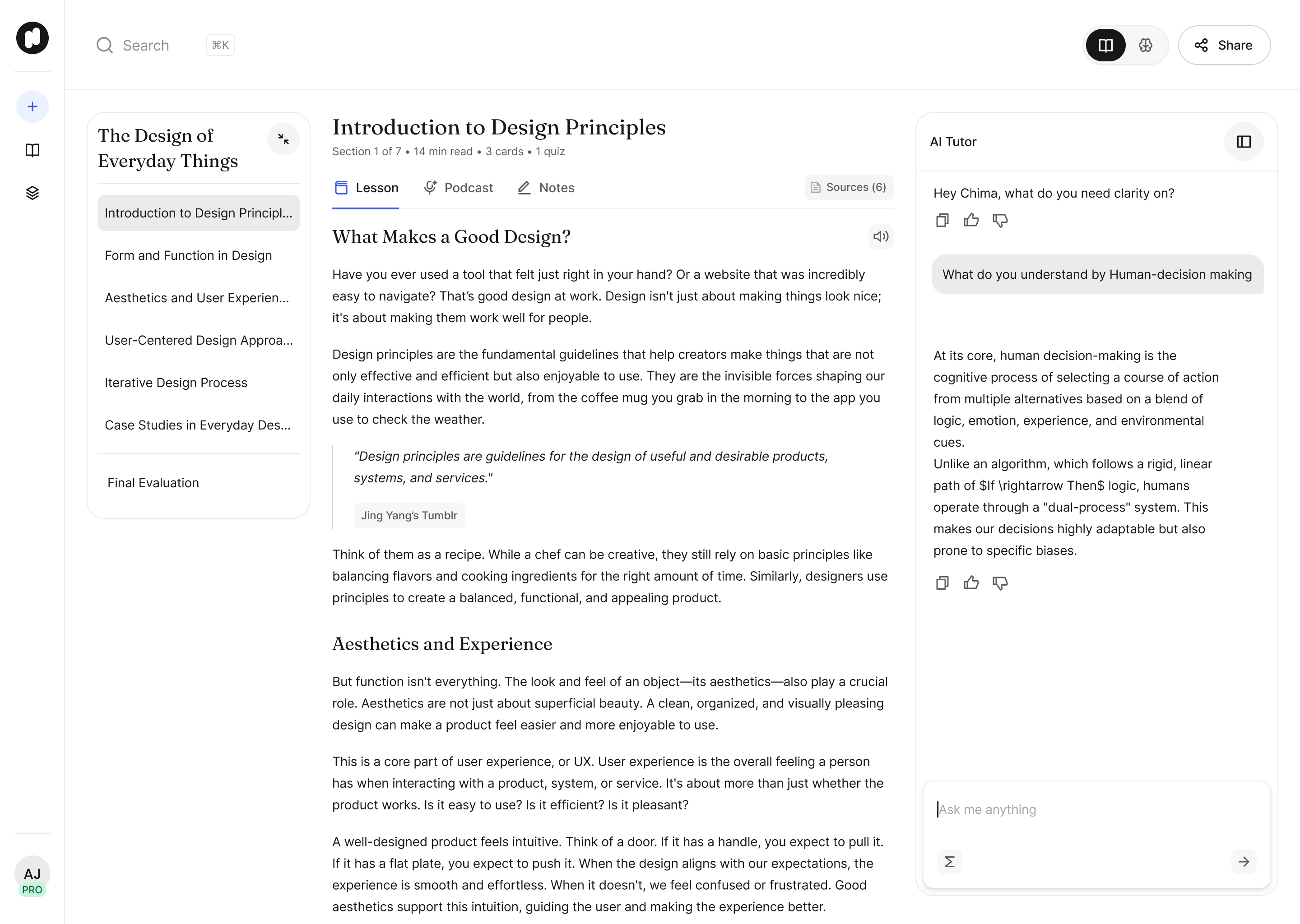
This is the screen where the product has to earn the learner's trust, so I approached it as a reading experience first and a dashboard second. The generated course arrives as a set of chapters and sections, and the visual hierarchy needed to make that structure feel deliberate and authored rather than mechanically extracted. Using a clear type scale with confident, distinct chapter titles, quieter section labels beneath them, and comfortable, readable body text, so the eye could move from the shape of the whole course down into any single lesson without effort. The major constraint behind this step is that the model is only as good as what gets fed to it. A clean textbook chapter produces a plan with real structure. A rambling lecture recording or a badly scanned PDF produces something thinner and the model has no way of telling you that. It generates with the same confidence either way. I wasn't working on the generation pipeline, so I couldn't make weak output stronger. What I was able to do was stop the interface from overselling it.
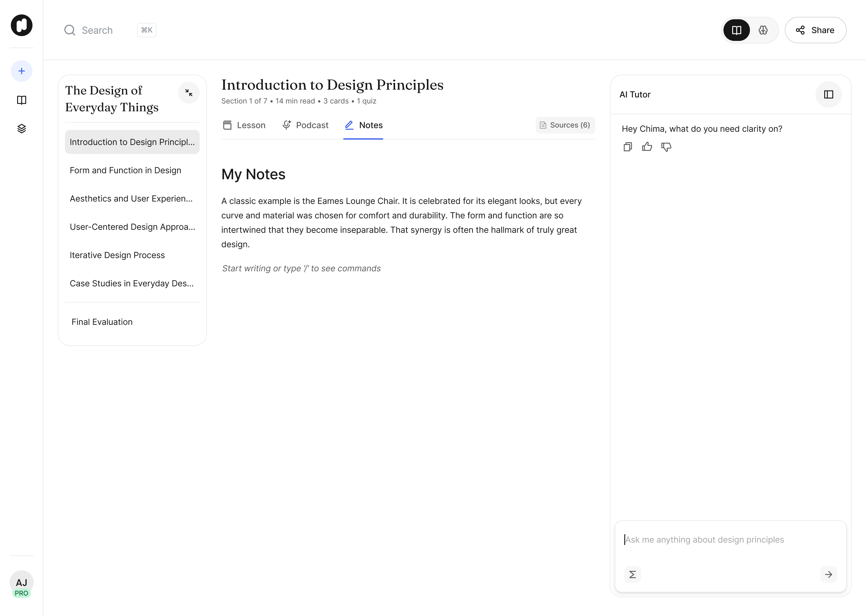
The clearest version of this was chapter weight. Generation doesn't distribute evenly, so one chapter arrives with genuine depth and the next is a single idea stretched to fill a slot. Uniform row treatment makes both look equally authoritative, which is the kind of small dishonesty that costs you the user the first time they click into the weak one. The metadata line under each section title carries that work. Reading time, card count, quiz count, all describing what actually got generated rather than promising something up front. A section that shows “14 min read, 3 cards, 1 quiz” is describing itself accurately which gives the learner an accurate measure of the volume quality based on the generated content
The other decision was treating the plan as a draft rather than a verdict. Generation isn't deterministic. Run the same source twice and you get two defensible structures, neither of which the learner can verify as correct. So rather than defend the output, the screen gives them room to move through it on their own terms: start anywhere, skip a chapter that isn't landing, go to the tutor when a lesson comes up short. The failure I was designing against was a learner studying a potentially bad chapter and deciding to abandon the generated study plan because it does not hold up logically.
Spacing carried a lot of the essence of my efforts here. Instead of packing chapters into tight, list-like rows, I gave each one room to breathe, which made a list generated in under a minute feel considered rather than dumped onto the page.
A COHESIVE LANGUAGE ACROSS DIFFERENT TOOLS
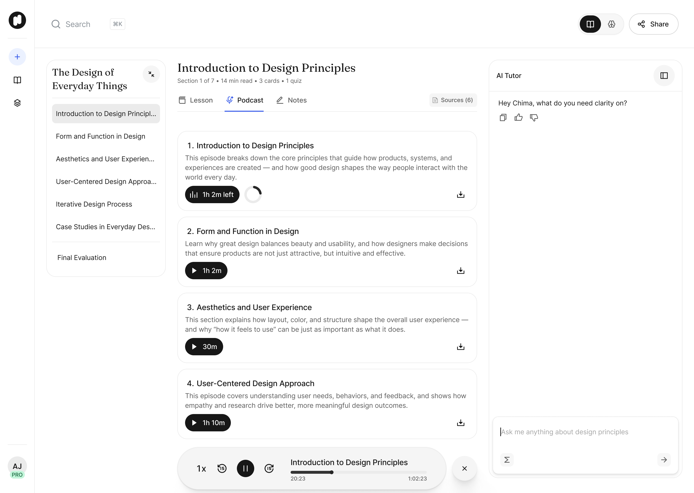
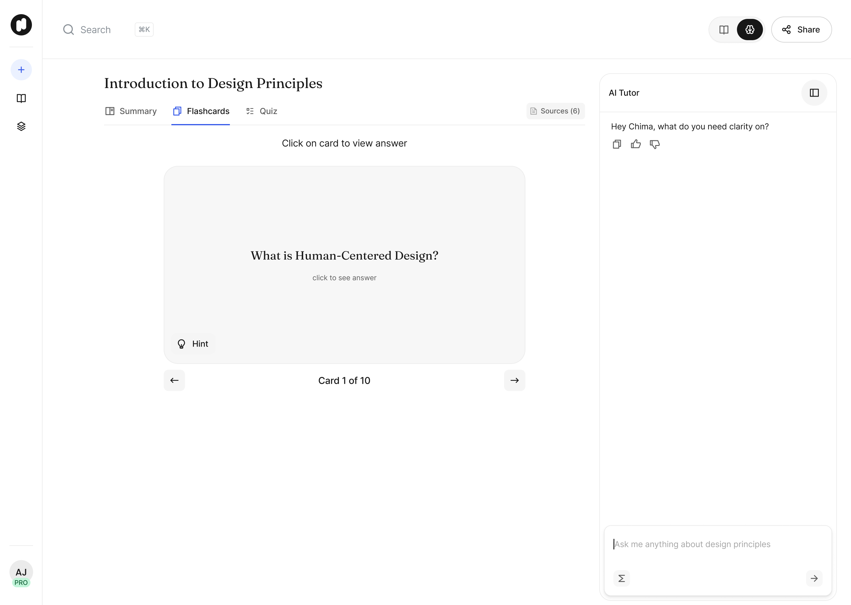
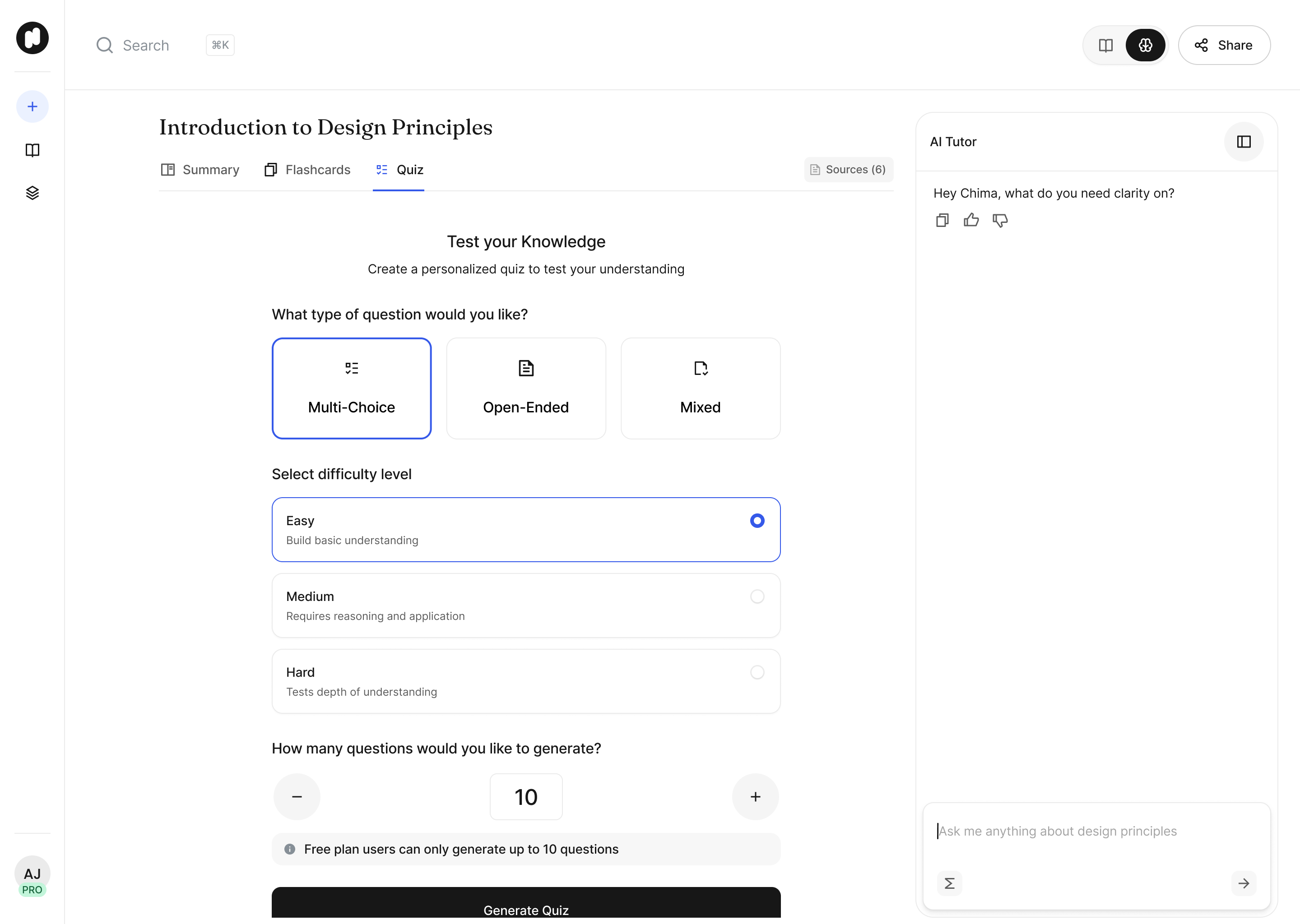
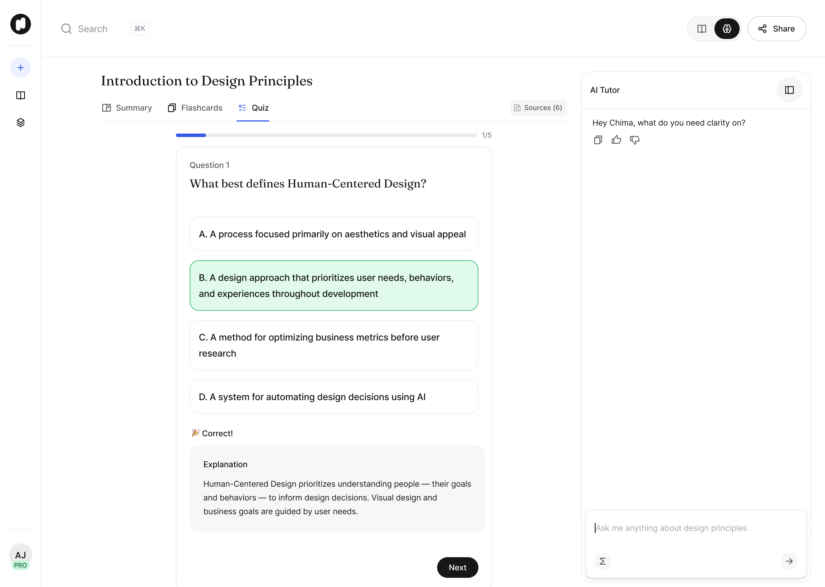
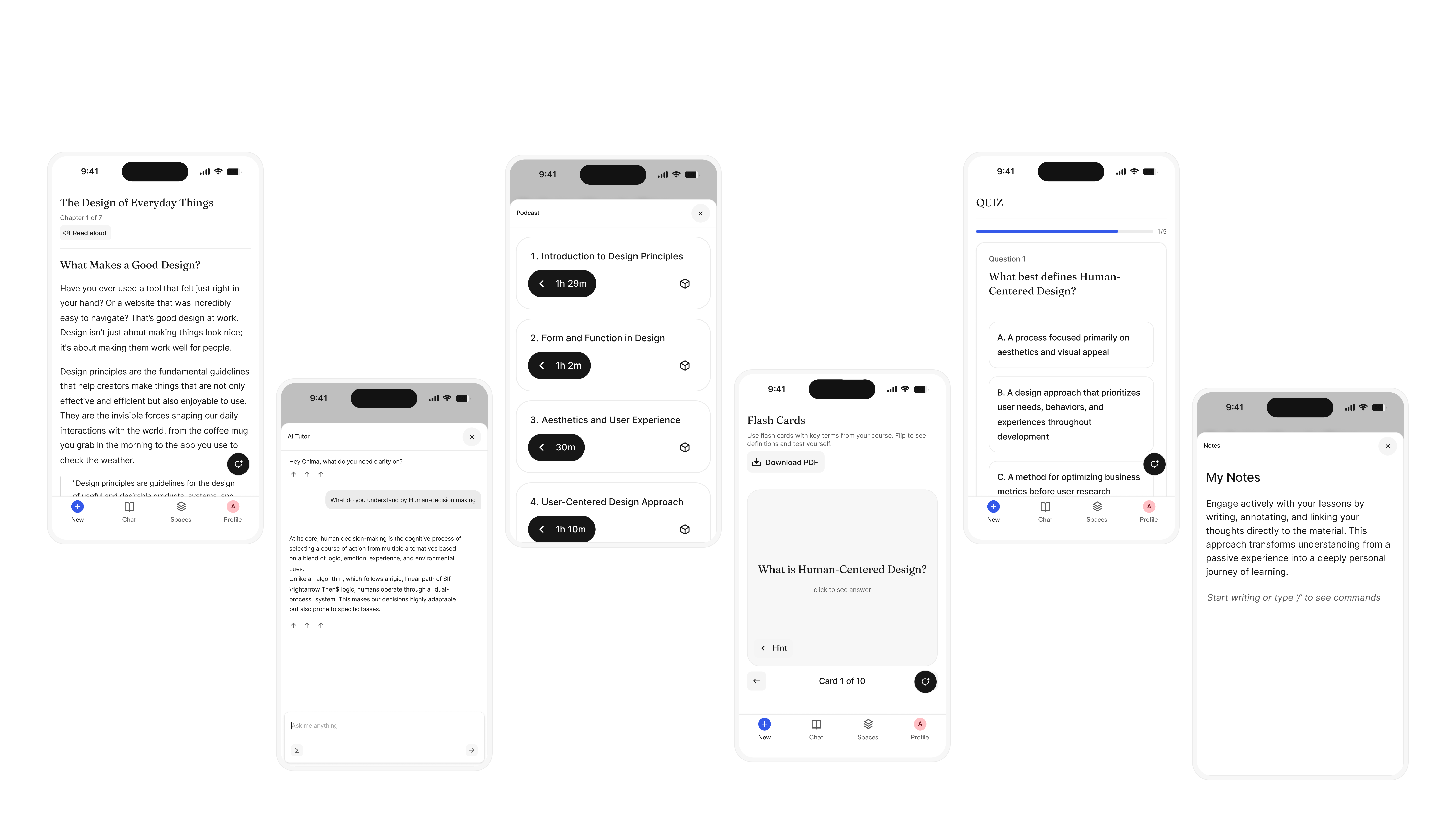
Six distinct tools: structured lessons, an AI tutor, flashcards, a podcast mode, quizzes and notes, is exactly where a product like this tends to fall apart visually, with each feature drifting into its own look as it gets built. I treated all six as one system from the outset rather than as separate features to skin individually. A shared component set, the same cards, buttons, headers and containers reused everywhere, meant a flashcard and a quiz question were visibly built from the same family of parts, even though they served different moments in the learning flow. The AI tutor was the hardest piece to place. It needed to feel present and conversational without competing with or undermining the lesson content sitting next to it. I designed it to live in the same visual key as the rest of the lesson so it read as a natural extension of the material, a patient guide built into the course.
The color and type helped bring the six tools together. The same restrained palette and type scale carried through every one of them, so moving from reading a lesson to drilling flashcards to listening to the podcast mode never felt like switching apps. Each tool still needed enough identity to be instantly recognizable, so I gave each one a single distinguishing icon and a light accent treatment, always expressed within the shared visual language rather than breaking from it.
OUTCOME
Since launch Nuton has been used by over 150000 learners to generate more than 3000000 structured lessons and counting, with lots of positive feedback from users appreciating the simplicity of the platform and acknowledging how much of a valuable tool it is in aiding their learning. This project was personal to me before it was professional. As a recently graduated master's student, I knew the feeling of falling behind firsthand and I kept hearing the same thing from people around me: classmates buried under reading they could not get through, struggling to turn dense material into something they could actually keep up with. The problem Nuton was taking on was one I was living and that is what pulled me towards it. I wanted to help build something I needed and recognized the value of leading efforts to ship such a project. The goal for Nuton is to have millions of students all over the world use it as a learning companion and I believe it is something achievable within the next 2-3 years. If you're a student reading this or just someone that needs a simpler way to study any subject make sure to give Nuton a try!